Designer's Comments
Look carefully for specific instructions
DO NOT REDISTRIBUTE
DO NOT JOCK/STEAL CODES
All forms of flash might not be moved to the top left corner , if it does please look for and remove the following code
Directions:
You Must have BASIC HTML KNOWLEDGE i want no messages of asking how to do anything...
DO NOT REMOVE THE CREDITS ON THE LAYOUT THANK YOU
Also please replace all XXXXXXXX before placing on to myspace. Failure to do so will result in the links turning to msplinks and no one will be able to comment you nor will the links work as they should.
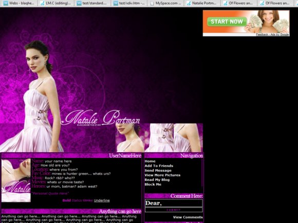
Credit: http://colorfilter.net/
http://peach-autumn.net/
Commentbox: http://panicked.nuclearcentury.com/
PSD: http://www.majestic-skies.net/psdelightful/
NOTE: In the cB preview, the ad is hidden but once placed on MySpace the ad is not hidden.
if u want a cleaner image of the header replace
http://layouts.cbimg9.com/33/16450c.jpg
with
http://img385.imageshack.us/img385/8626/natalieportmanyl9.jpg
don't message me if u have no idea how to do this
DO NOT REDISTRIBUTE
DO NOT JOCK/STEAL CODES
Using This Layout
For specific instructions read designer's comments
- This is a div overlay layout, html knowledge required!
- 1. Log into myspace.com
- 2. Click on Edit Profile (Profile 1.0)
- 3. Copy (ctrl c) and paste (ctrl v) code to the specified fields
Layout Comments
Showing latest 10 of 10 comments

I love the set up & the colors, very nice!
its creative/unique, love the rich purple

I adore her and this layout. Thel3oss - Please do not spam here. If you have nothing to say about the layout at all then your post is not needed. She makes her layouts on what she is into not you.

QUOTE(Thel3oss @ Feb 2 2007, 8:41 PM) [snapback]2440715[/snapback]not into that stuff make some lil wayne shitsuggest u comment on the layout or on ways to improvei can care less on who u fancy... i hate rap and r&b which is why u see none of
not into that stuff make some lil wayne shit

Its pretty, it makes think of someone elses layout I've seen around though I can't think of where it was though. Looks good

i agree the color is beautiful and i love the setup

beautiful! i love the color

Well done, very creative. :] Your use of brushes is just unbelieveable.
Quite boxy and blocky but I do like the graphic; good use of brushes/texture? Natalie Portman's head/face looks funny in that picture but that has nothing to do with you. Good choice of colour - again unconventional. The navigation could do with a lit
Layout Details
| Designer |
Blaqheartedstar
|
| Submitted on | Feb 1, 2007 |
| Page views | 18,008 |
| Favorites | 23 |
| Comments | 10 |